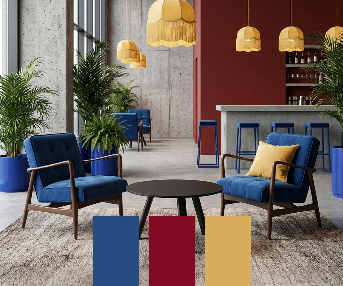
Colour is set to play a bigger role in commercial interiors in 2027, with warmer, richer shades offering an alternative to the cooler neutrals of recent years. For hospitality venues, furniture provides a practical way to introduce these colours through upholstery, frames and finishes without committing to a complete redesign.
Here, we look at three key colours for 2027. We’re calling them ‘The New Primaries’: richer, more sophisticated interpretations of red, yellow and blue suited to contemporary commercial interiors.
At a Glance: The New Primary Colours for Commercial Furniture
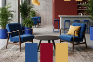
Our New Primaries palette for 2027 reinterprets classic red, yellow and blue through Oxblood Red, Butter Yellow and WGSN’s Colour of the Year, Luminous Blue.
- Oxblood Red: The sophisticated grounding shade that’s a warmer alternative to black and charcoal in hospitality spaces.
- Butter Yellow: The uplifting ‘soft neutral’ replacing cold greys to create warmth and visual comfort.
- Luminous Blue: The high-impact statement shade (WGSN Colour of the Year 2027) used as a focal point.
The Return of the Pigment: Why Commercial Interiors are Embracing Colour
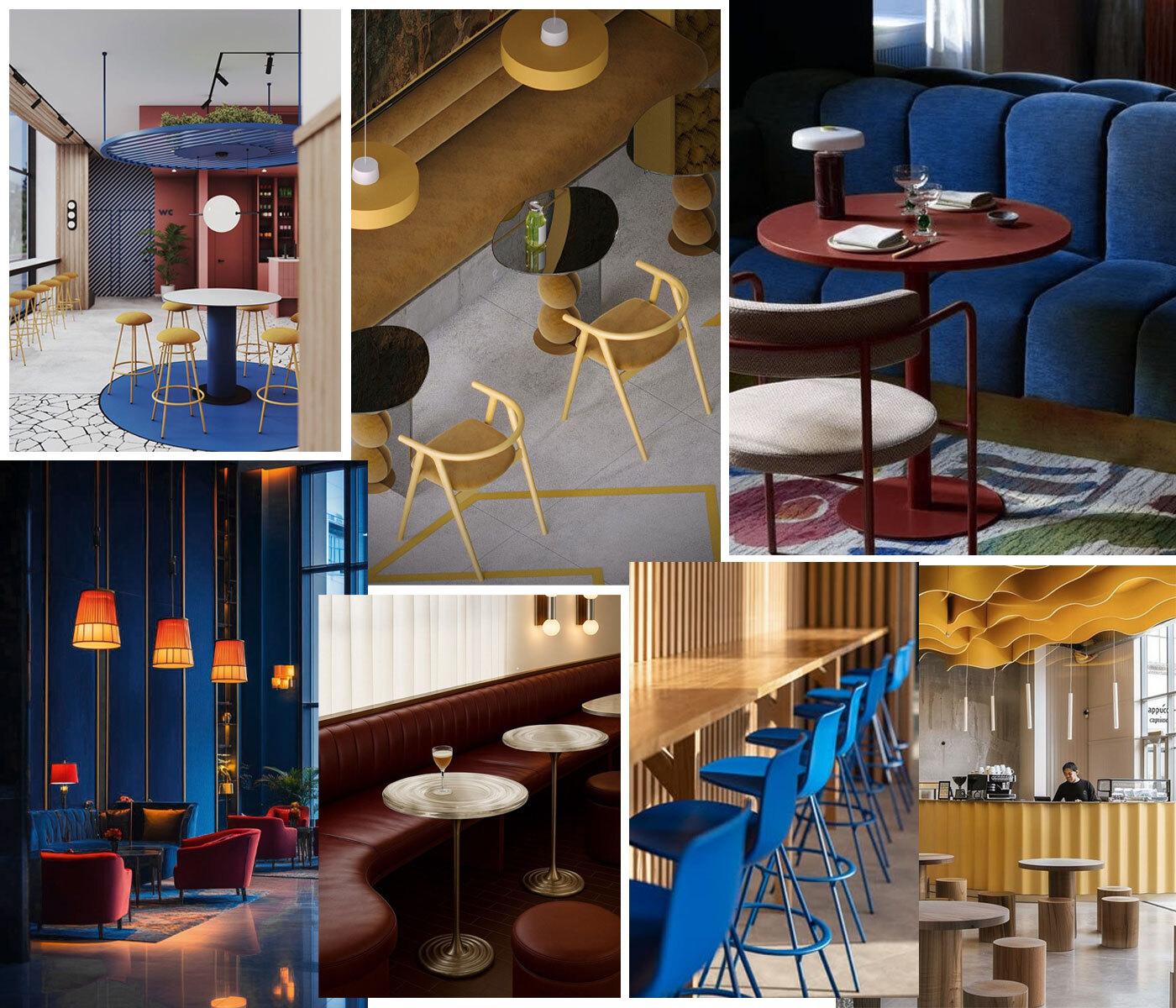
For years, commercial interiors have been dominated by cold Scandi tones and innocuous greys. Driven by a desire for safe, neutral palettes, hospitality venues and workplace environments inadvertently embraced a monochrome look that felt sterile rather than sophisticated.
Designers and venue operators are now pivoting toward sensory minimalism - an approach that pairs clean architectural lines with intentional, high-pigment contrast. Rather than overwhelming a space, dynamic, elevated versions of primary hues are being used strategically in commercial furniture to evoke emotion by creating strong focal points.
Achieving the perfect balance with The New Primaries relies on custom specification. Rather than relying solely on off-the-shelf stock, modern commercial projects utilise tailored upholstery options, custom powder-coated metal frames, and bespoke wood stains - ensuring every element complements the venue's overall scheme.
Oxblood Red (The Grounding Anchor)
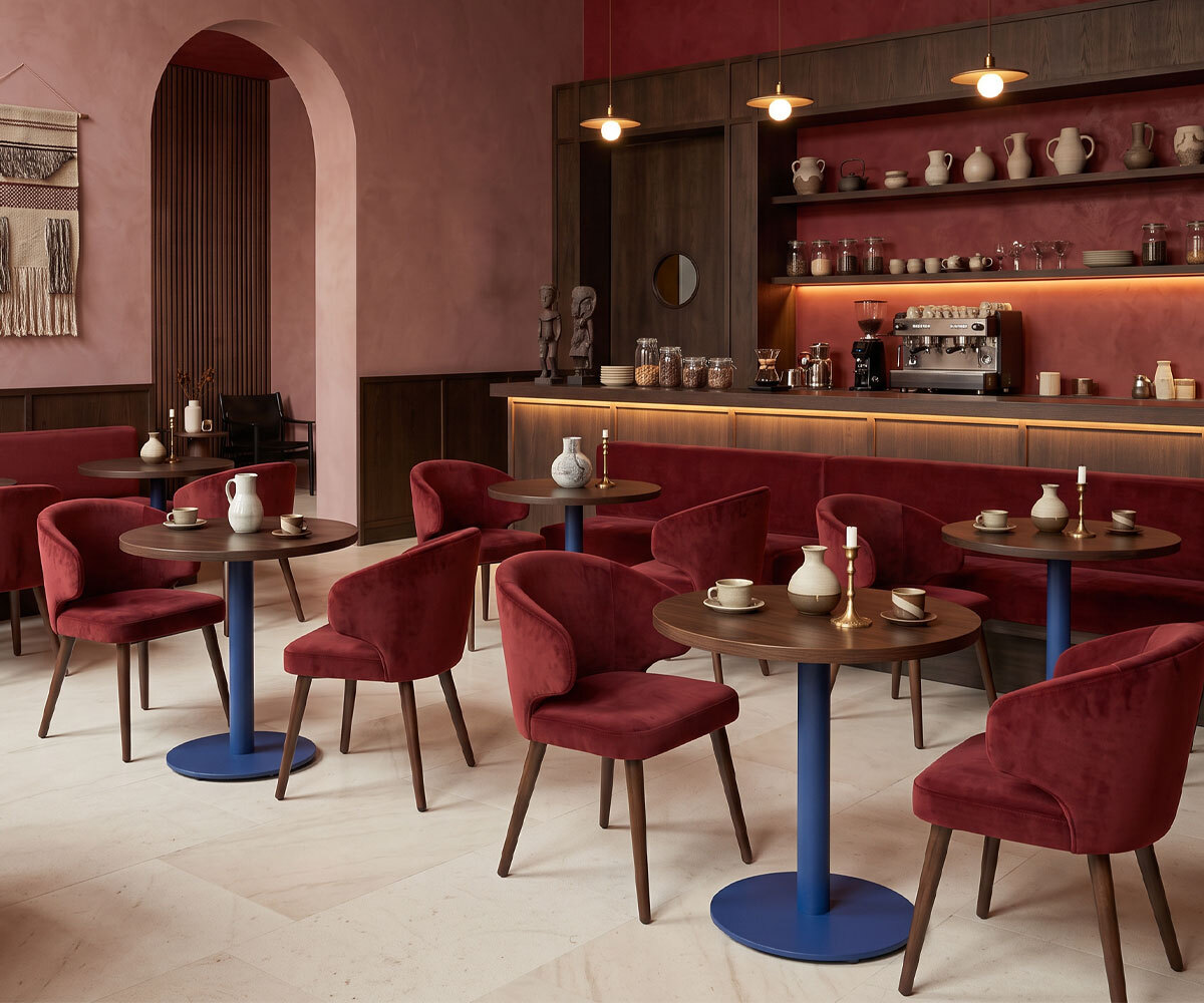
The Role: Oxblood Red can act as an anchor in modern commercial venues. Where jet black can feel stark and cold charcoal often absorbs light without adding personality, oxblood offers a deep, pigment-rich dark tone with a sense of heritage and warmth.
Commercial Benefits: In hospitality and fine dining, the colour evokes intimacy, heritage, and luxury, helping create the intimate, relaxed atmosphere often sought in restaurants and bars.
Contract Furniture Specs: The deep tones of Oxblood Red work wonderfully when specified across custom-built banquette seating or tailored lounge chairs. Specify custom Crib 5 contract velvets or supple genuine or faux leathers, finished with bespoke dark walnut or stained beech timber frames.
Shop the Look
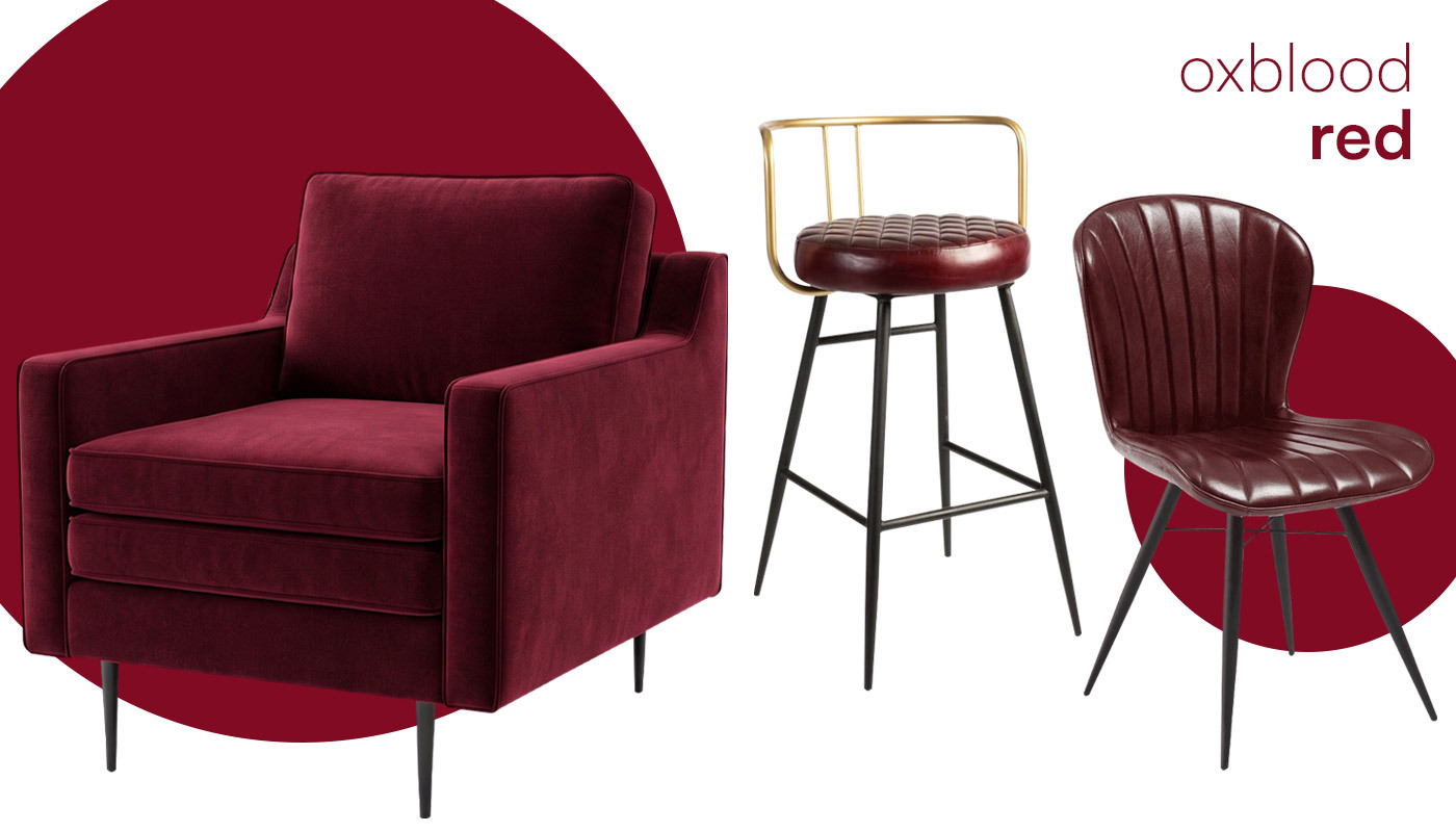
Showcased here in rich oxblood velvet, the Elmore Armchair brings plush comfort to hospitality spaces. Meanwhile, contract-grade leather in this deep, decadent tone elevates the Aulenti High Stool and Lars Side Chair, with the Aulenti’s brushed gold frame adding a refined, high-end edge.
Butter Yellow (The Soft Optimism Neutral)
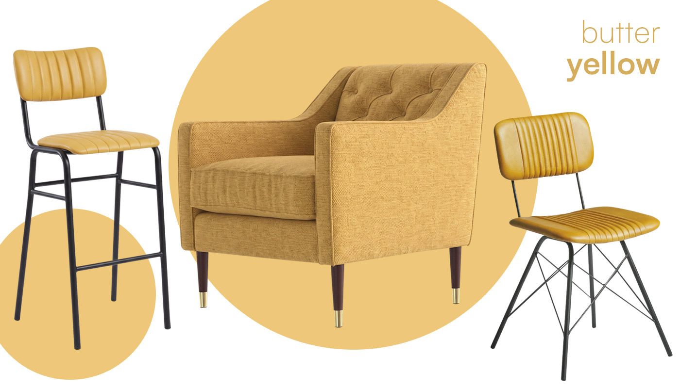
The Role: Butter yellow serves as a functional base tone for modern interiors. While traditional primary yellow can feel aggressively bright and overstimulating in large doses, butter yellow delivers a creamy, warm glow that lifts a space without dominating it.
Commercial Benefits: In cafés, ‘workspitality’ setups, and daytime hospitality venues, butter yellow can bring warmth and energy to daytime working and social spaces. By softening the hue to a creamy butter tone, venue operators can introduce natural warmth that keeps guests energised yet comfortable.
Contract Furniture Specs: Specify butter yellow across custom polypropylene seating, or order bespoke upholstered side chairs featuring contrast piping to introduce subtle brand accents.
Shop the Look
Soft butter yellow brings an uplifting warmth to the Duke Side Chair in supple genuine leather, while the Tavo Bar Stool offers complete design versatility - ready to be customised in your choice of any contract-grade fabric or faux leather. For lounges, the Prestbury Armchair in a textured butter yellow chenille delivers welcome warmth while meeting commercial durability standards.
Luminous Blue (The Statement Focal Point)
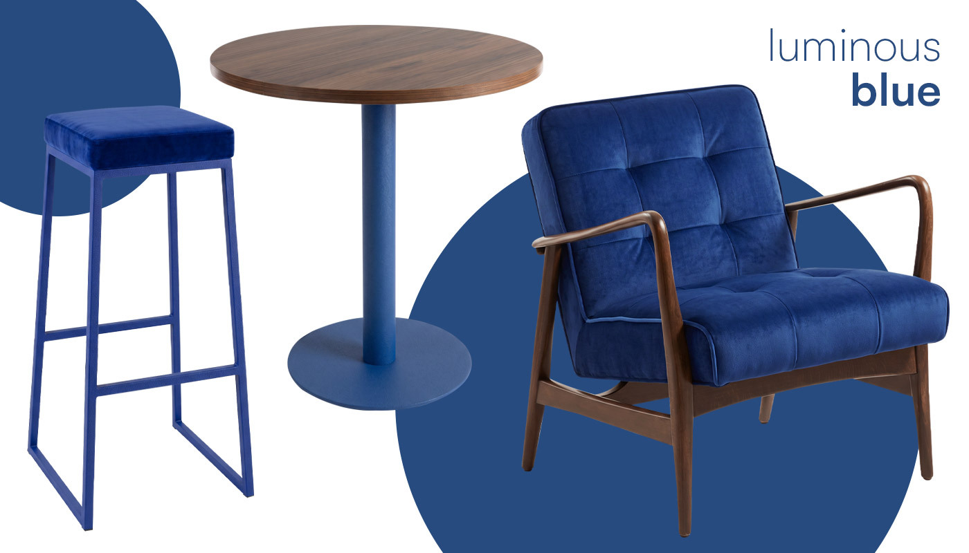
The Role: Inspired by WGSN/Coloro’s forecast for Luminous Blue as a key trend direction, this shade serves as the ultimate accent. It provides a striking alternative to safe, flat blues and acts as a high-impact shade to define key zones.
Commercial Benefits: In large open-plan commercial venues, hotel lobbies, and flexible layouts, luminous blue naturally draws the eye. Designers use this shade for strategic space zoning - instantly signalling key areas such as welcome reception zones, collaborative spaces, or central bar counters without constructing physical walls.
Contract Furniture Specs: Highly saturated luminous blue works best when paired with strong structural forms. Utilise bespoke booths made-to-measure for your floor plan or specify custom powder-coated metal bases paired with contract-grade Crib 5 velvet sofas.
Shop the Look
Make a bold visual impact with Luminous Blue velvet on our customisable Style Stools or the retro-inspired Darwen Lounge Armchair. For a more subtle architectural detail, pair the warm wood grain of our Omega Walnut Table Top with a Moderno Table Base powder-coated in custom Luminous Blue—proving that vibrant accents can elevate a room without dominating it.
How to Pair ‘The New Primaries’ with Tactile Materials
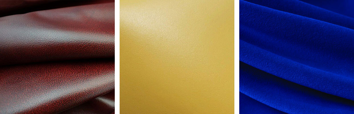
To successfully use high-pigment hues without overwhelming a commercial space, balance is key. Pairing bold tones with warm natural timbers, tactile textiles, and architectural metalwork ensures your scheme feels grounded, luxurious, and built for commercial longevity. Here’s a quick reference guide:
| Colour | Role in Venue | Material and Texture Pairings | Ideal Furniture Application |
| Oxblood Red | Anchoring base | Dark walnut, brass, heavy velvet | Banquette seating, lounge chairs, leather stools |
| Butter Yellow | Warm neutral | Light oak, micro-concrete, matte laminate | Polypropylene furniture, cafe chairs, contrast piping |
| Luminous Blue | Statement focal point | Brushed chrome, dark wood, textured boucle | Soft seating, high-backed booths, metal frames |
.
How to Use ‘The New Primaries’ Together in Hospitality Spaces
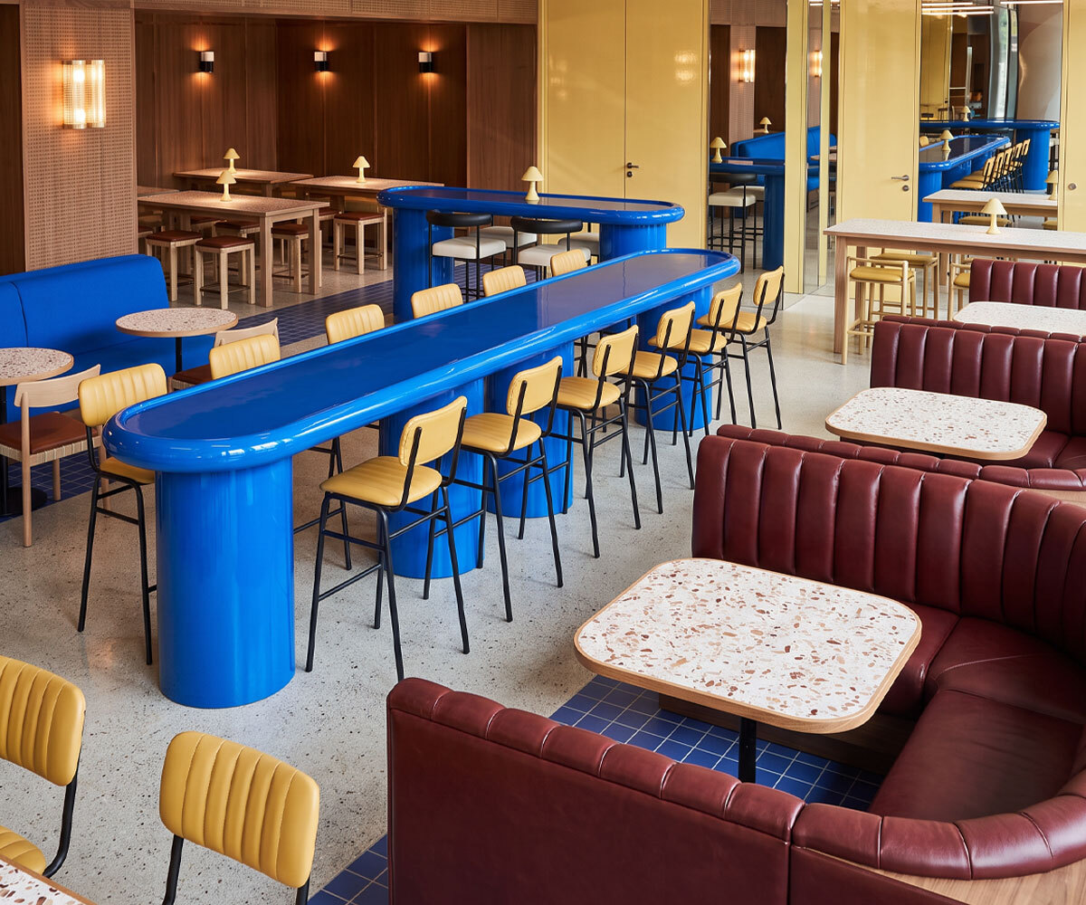
A common challenge when combining primary tones is giving each colour equal weight, which can make the scheme feel overly busy and like a primary school classroom. Instead, use a clear visual hierarchy, with one dominant shade, one supporting tone and one carefully placed accent.
When specified with purpose, these colours work together seamlessly across open floor plans. The secret is treating them as three distinct functional layers. As a starting point, consider:
- 60% Anchor – Oxblood Red:Grounds perimeter seating, banquettes and booth areas
- 30% Transition – Butter Yellow: Lifts central seating and lighter furniture elements
- 10% Statement – Luminous Blue:Draws attention to bar stools, feature chairs or focal areas
If combining three colours is just too much for your space, then why not use them as targeted accents that breathe fresh life into an existing interior. If your venue already features neutral finishes - like exposed brick, concrete floors, or natural timber wall panelling - you can elevate the entire room by introducing bold tones in small, strategic doses.
Details like custom piping or buttons on soft seating, feature dining or bar chairs, or loose scatter cushions can lift your space while keeping your spend low and preserving the core character of your venue.
Commercial Specification Checklist for High-Traffic Venues
When specifying vibrant upholstery and contract-grade frames for hospitality projects, ensure your selections meet UK commercial standards:
- Fire Safety: Check that upholstery, fillings and furniture specifications meet the appropriate fire-safety requirements for your venue and intended use. Our team can help advise on suitable contract furniture options.
- Durability: Specify contract-grade fabrics or leathers for high-impact lounge and reception seating.
- Stain and Moisture Resistance: Choose treated velvets, faux leathers, or polypropylene that can withstand daily cleaning and heavy footfall.
Specify 'The New Primaries' for Your Next Project
Want to embrace colour in your next commercial project? Whether you are refreshing an existing venue or specifying furniture for a new project, our team can help you select suitable upholstery, frame finishes, table tops, and made-to-measure seating.
Get expert advice tailored to your space:
Call: 01452 336 520
Email: sales@eclipsefurniture.co.uk
Request a free consultation: Fill in our quick contact form
Frequently Asked Questions
What colours are trending for commercial interiors in 2027?
The defining commercial colour trend for 2027 is the transition from cold grey neutrals to "sensory minimalism" using The New Primaries. This palette replaces classic primary brights with elevated, contract-grade shades: Oxblood Red (as a grounding neutral base), Butter Yellow (as a warm background tone), and Luminous Blue (as an architectural focal point).
Can Eclipse Furniture customise upholstery and frame colours?
Yes. We offer a wide range of furniture that can be customised to suit your design scheme. We offer bespoke wood staining, custom powder-coating for metal frames, made-to-measure banquette seating, and an extensive library of contract-grade fabrics to fit your project specifications.
How can I introduce colour into a restaurant or café?
The most effective way to introduce colour without overwhelming a commercial space is through strategic zoning and material contrast. Rather than painting all walls a single bright shade, use high-pigment contract furniture to create intentional focal points:
What colours work well with natural wood furniture?
Natural timber stains pair exceptionally well with rich, warm pigments and warm neutrals because wood grain brings organic texture to solid colour schemes:
- Light Oak & Ash: Best paired with Butter Yellow or soft warm tones to create an uplifting, modern setting suitable for Scandinavian-inspired cafés and daytime workspaces.
- Dark Walnut & Stained Beech: Best paired with Oxblood Red and deep jewel tones. The dark wood frames enhance the heritage feel and luxurious depth of leather or velvet banquettes.
- Mid-Tone Timbers: Pair beautifully with Luminous Blue or rich cobalt tones, where the natural warmth of the wood provides an earthy balance to the electric vibrancy of the blue upholstery.