(Image Credit: Pantone)
What is the Pantone Colour of the Year for 2026?
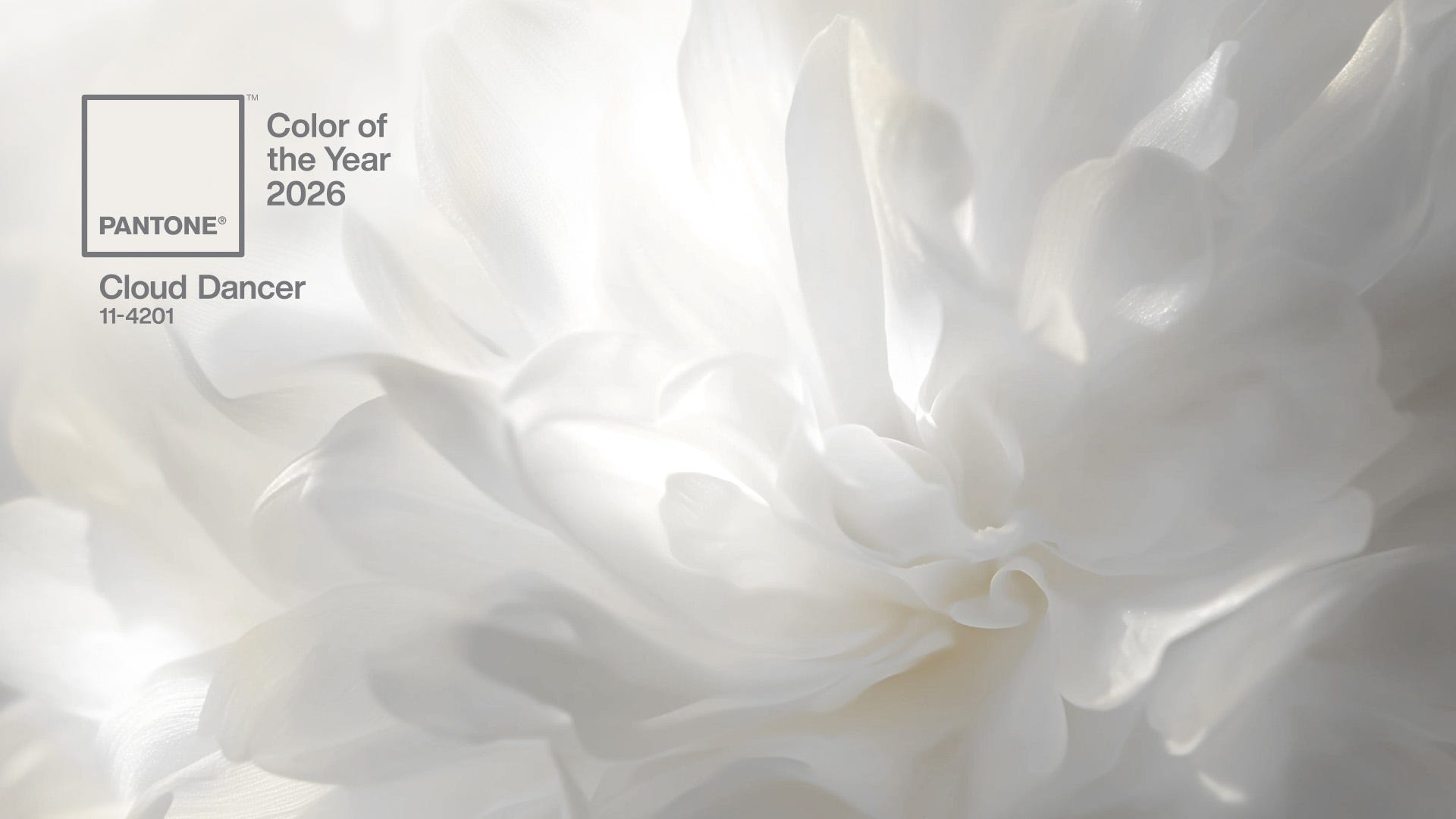
Every year, colour experts Pantone select a shade that dictates the tone for global design, and for 2026, the palette has shifted skyward. Say hello to 'Cloud Dancer'. According to Pantone, it’s a billowy white imbued with serenity that encourages true relaxation and focus. It may be a serene shade, but it’s causing controversy across social media, with many people branding the colour clinical and boring.
(Image Credit: Pantone)
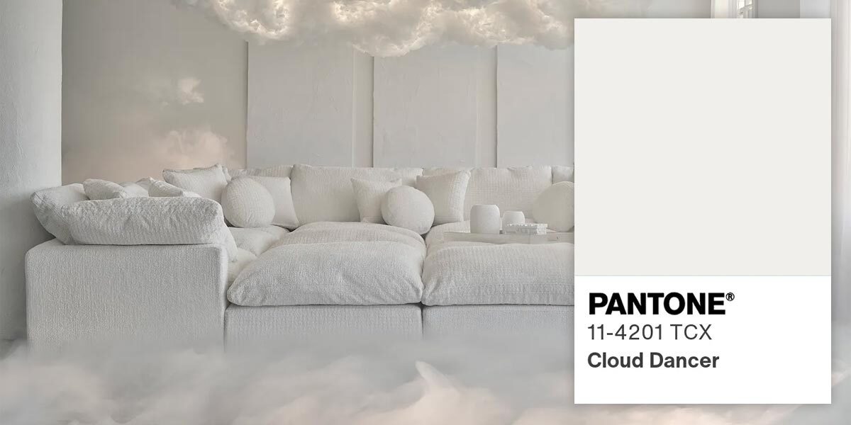
Off-White – Bland or a Beautiful Blank Canvas?
Love them or loathe them, people are drawn to tranquil tones. But in the demanding, high-traffic world of hospitality, where durability and stain-resistance are non-negotiable, is a delicate shade like Cloud Dancer really a wise choice? We explore how this chalky neutral can be successfully used to create beautiful spaces and also highlight potential issues with choosing such a pale colour for commercial furniture and decor.
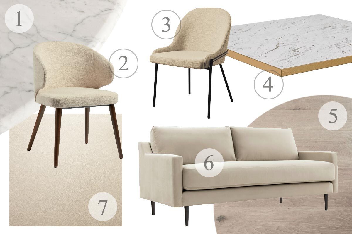
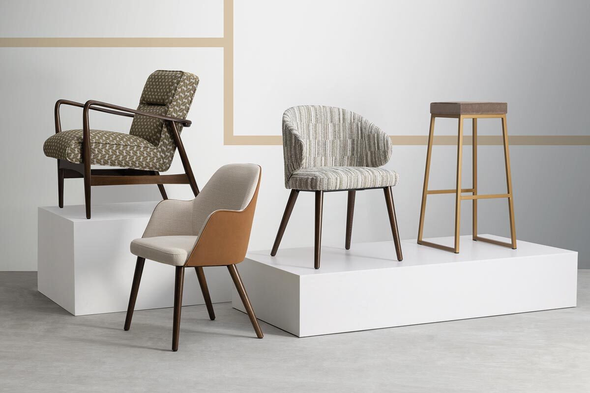
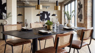
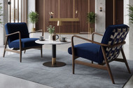
1. Carrara Marble Table Top 2. Selma Armchair 3. Westbury Side Chair 4. Omega Table Top 5. Rustic Solid Oak Table Top 6. Barton Sofa 7. Faux Leather in Linen
Are White and Cream Good Colour Choices for Hospitality Environments?
Cloud Dancer may be ‘Colour of the Year’, but soft shades like this creamy off-white have been used to great effect in high-end design for decades. They’re versatile, timeless tones that can be paired with almost any other colour. But let’s not ignore the white elephant in the room – neutrals just get dirty, right? They certainly demand more maintenance than darker shades but choosing the right materials and locations can make all the difference. Here are some pros and cons of using neutral colours in hospitality environments:
The Pros of Using Neutrals
The Illusion of Space: Pale colours reflect light, and don’t interrupt the flow of the room, making smaller spaces feel more open.
The Cleanliness Cue: In hospitality, shades of white and cream symbolise cleanliness and freshness.
Timeless Versatility: Chalky neutrals act as a foundation on which other brand or trend colours can be added.
The Cons of Using Neutrals
Spills and Stains: Let’s be honest, hospitality environments are a breeding ground for food and drink stains.
The Cold Factor: If not styled correctly, light neutrals can make interiors feel clinical rather than cosy.
Wear and Tear: High-traffic areas like hallways and receptions areas can result in scratches and scuffs.
It’s all about balance when it comes to neutrals, and with a few pointers kept in mind, it can make up part of a stylish and welcoming colour palette. You might have heard of the ‘quiet luxury’ trend in recent years. It’s all about understated elegance, prioritising beautiful craftsmanship and high-quality materials over showy displays and brash design.
In an article about how hotels decide on colour schemes, Hotel Speak discusses how The Langham uses neutrals to great effect. “The Langham in New York makes use of a multitude of neutral tones, including pale gray, beige, and cream, in every corner of their hotel rooms. This creates a sense of familiarity and tranquillity in guests. Neutral tones are comforting, unchallenging, and psychologically linked to cleanliness.”
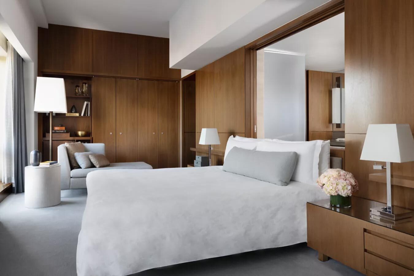 The Langham, New York (Image Credit: The Langham)
When choosing commercial furniture in neutrals tones, it’s always a good idea to opt for a fabric which is stain-resistant, making it much easier to keep clean. It’s also worth considering where you’re placing neutral furniture – a lobby or lounge will harbour fewer potential stains than a family restaurant. And if you’re using neutrals in your décor, how about adding a darker shade lower down, keeping the lighter tones higher, away from scuffs and scratches.
How Can I Prevent Neutrals from Looking Clinical or Cold?
The key to working with neutrals, whether in domestic or commercial setting is texture and tone. If a room’s décor, furniture, and accessories were all in one flat tone of off-white, it would definitely give off futuristic waiting room vibes. To keep your venue from looking cold, you should use neutral tones as a base, and layer with accent shades that are warm and inviting. The people at Pantone haven’t just stopped at making Cloud Dancer their colour of the year, they’ve even produced a range of palettes which enhance this neutral shade and give cues on how to use it in the real world.
Colour Palette – Comfort Zone

(Image Credit: Pantone)
According to Pantone, “Everyone needs a comfort zone, a place to disconnect, to unwind and decompress. The natural and organic colours surrounding Cloud Dancer are embracing and inclusive, rendering a sense of reaffirming repose.”
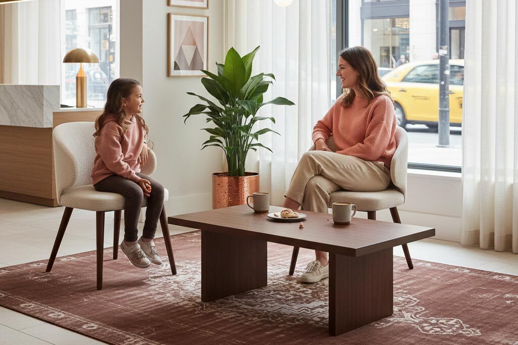
The comfort that guests crave comes from adding warm, natural colours such as coral, rose, and sand. Deep rich tones like copper and walnut woods will make the look feel grounded and inviting. It’s also important to mix your textiles to achieve a fully rounded finish. Opt for beautiful, recycled boucle like in our Selma Armchairs, the delicate texture of hanging voiles, or the warmth of an overdyed wool rug.
How Can I Make Neutrals Feel Luxurious?
Colour Palette - Glamour Gleam

(Image Credit: Pantone)
The experts at Pantone say about the Glamour Gleam Palette, “The yin of white inevitably meets the yang of black, accented by a sultry lipstick red. The glamour is heightened by vintage wine and teal, glimmering graphite, shimmering grey, and a silvery satin metallic.”
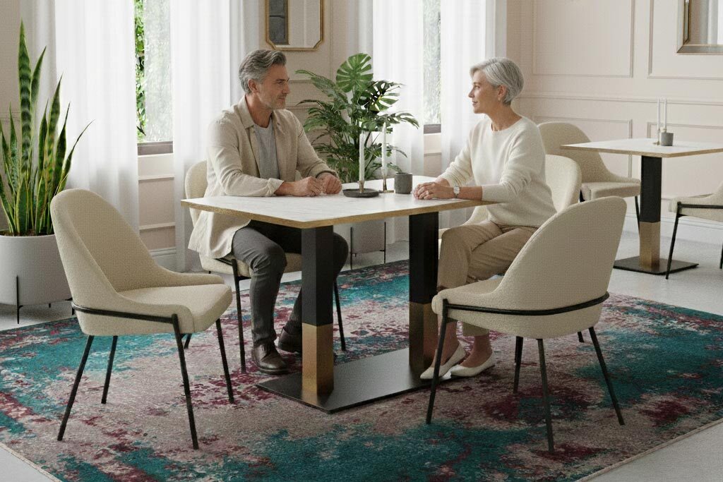
Neutrals may not seem the most glamorous choice, but as we’ve discussed, they emanate a quiet luxury, and when paired with darker, richer tones, can create a bewitching backdrop. Our Westbury Side Chairs are so striking because of the juxtaposition of the soft cream boucle with the minimal black metal frame. The addition of jewel-inspired accents of scarlet, teal, and olive will elevate neutrals to another level.
Go Custom with Classic Neutrals
If you’re yearning after commercial furniture in neutral tones but can’t find exactly what you’re looking for, then it’s time to customise! Our range of customisable furniture allows you to take our most popular products and put your own stamp on them. From fabric and upholstery style to wood stain and metal frame colour, the choice is yours. Browse our Customisable Furniture brochure for more inspiration.
Should I Use Cream and Off-White Shades in my Commercial Venue?
The easy answer is yes! We believe that neutral tones can be a great choice for commercial furniture and interiors. Their enduring appeal lies in their ability to balance sophistication with a sense of welcome. By using neutrals, you can create a blank canvas, which when layered with rich textures, warm accents, and grounding tones, can become a moment of calm for guests in a noisy world.
Get in Touch...
If you’d like some advice on how you can make neutrals work for you, just get in touch. For more information about any of our design-led commercial furniture, to book a free consultation, or to visit our showroom, please don’t hesitate to call us on 01452 336 520 or email sales@eclipsefurniture.co.uk.
FAQs
What is the Pantone Colour of the Year 2026?
The Pantone Colour of the Year for 2026 is a serene, off-white shade called Cloud Dancer. According to the Pantone experts, “Cloud Dancer is like a blank canvas that opens up space for creativity, allowing our imagination to drift so that new insights and bold ideas can emerge and take shape”.
Are light neutrals practical for high traffic hospitality areas?
There will always be pitfalls of using neutral colours in hospitality settings. With food and drink on the go all day, there are bound to be spills and stains. But choosing stain-resistant, hardwearing materials for furniture, and keeping lighter colours higher up in interiors, you can introduce stylish shades of cream and white without worry.
Will ‘Cloud Dancer’ go out of style next year?
Unlike bold or neon colours, neutrals, such as the creamy, off-white of Cloud Dancer, are true classics. Although it is being given the status of ‘colour of the year’, this soft shade has been a timeless staple of luxury design for decades. It won’t go out of fashion and is easy to update and accessorise.

